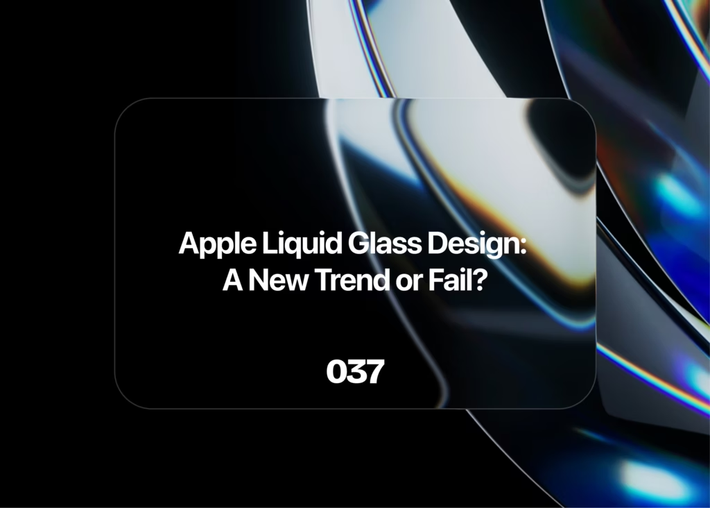
With the unveiling of iOS 26 at WWDC 2025, Apple introduced a new visual direction that is quite the opposite of “effortless” for many users. Their next-generation design language, called Liquid Glass, is already raising both excitement and concern.
#ios #ui #ux #design
What Should an Operating System Deliver in Terms of Design?
Design expectations for an operating system shift over time depending on who it serves and how the company positions it. But at its core, an OS must feel effortless — something you can use daily for 7–8 hours without friction, distraction, or fatigue.
With the unveiling of iOS 26 at WWDC 2025, Apple introduced a new visual direction that is quite the opposite of “effortless” for many users. Their next-generation design language, called Liquid Glass, is already raising both excitement and concern.
What Exactly Is Liquid Glass?
Apple’s marketing does what Apple does best — simple phrases that sound futuristic and elegant. “Liquid Glass” is the name they chose for their new design system, but the concept goes much deeper than the name suggests.
The idea is a blend of transparency and translucency, combined with liquid-like behavior. UI elements act and react as if they are made of fluid resting on transparent glass:
- Components deform with liquid-like animations when touched.
- Elements reflect and refract background content dynamically.
- Effects shift depending on device tilt and angle.
The result is a moving, shimmering interface that behaves almost like a physical material rather than a static UI.
Why Move Away from Flat Design?
Apple didn’t strictly need a design overhaul, but the shift isn’t surprising. Historically, whenever Apple changes its design direction, much of the industry follows. This causes brands to struggle with differentiation when the visual landscape becomes uniform.
Flat design had also reached a saturation point, becoming repetitive and less impactful. Meanwhile, competitors like Google and Samsung have also teased movement toward more dimensional, expressive interfaces.
On top of that, VisionOS had already introduced a more futuristic visual style. Extending that aesthetic across Apple’s ecosystem creates the consistent, unified feel Apple is known for.
Liquid Glass: A Step Forward or Backward?
Initial reactions at WWDC were overwhelmingly positive. The demos looked stunning — fluid movements, polished animations, and a modern glow. But now that more people are using the Developer Beta, a wave of criticism is emerging.
Potential Benefits
- Enhanced depth and dimensionality makes the interface feel more lifelike.
- Adaptive coloring reacts to light/dark mode and background content, creating a more aesthetic visual flow.
- Responsive, physics-based animations that move naturally in context, improving immersion.
Major Concerns
- Poor contrast makes it harder to focus or distinguish interface elements.
- Some animations feel more like rubber than glass or liquid, creating inconsistency.
- Busy backgrounds can make buttons and text almost disappear, especially in translucent layers.
- The UI often demands too much attention — instead of supporting the task, it competes with it.
Even though the system is meant to look subtle, the combination of distortion, reflections, and highlights can feel overwhelming, especially during extended use.
Conclusion
Apple’s Liquid Glass system is visually impressive and clearly ambitious, but it comes with noticeable usability issues. Because it’s still in Developer Beta, it’s too early to say whether this will become a beloved redesign or a short-lived experiment. However, compared to the typically polished nature of Apple’s releases, Liquid Glass feels less refined than expected.
What’s certain is that it marks the official end of Apple’s long-running flat design era — and the beginning of a more dynamic, more fluid, and more controversial chapter.
Frequently Asked Questions
1. What is Apple’s Liquid Glass design system?
Liquid Glass is Apple’s new design language introduced at WWDC 2025. It features translucent, fluid-inspired UI components that respond to touch, lighting, and device motion, creating a more realistic and immersive interface.
2. Why did Apple move away from flat design?
Apple shifted direction because flat design had become overused. Liquid Glass introduces more depth and personality, aligns with the power of new Apple hardware, and unifies the aesthetic across iOS, macOS, and VisionOS.
3. Is Liquid Glass better for usability?
It depends. While it offers stunning visuals and modern animations, many users report lower contrast and overly busy elements — making the UI harder to use in practical, day-to-day scenarios.